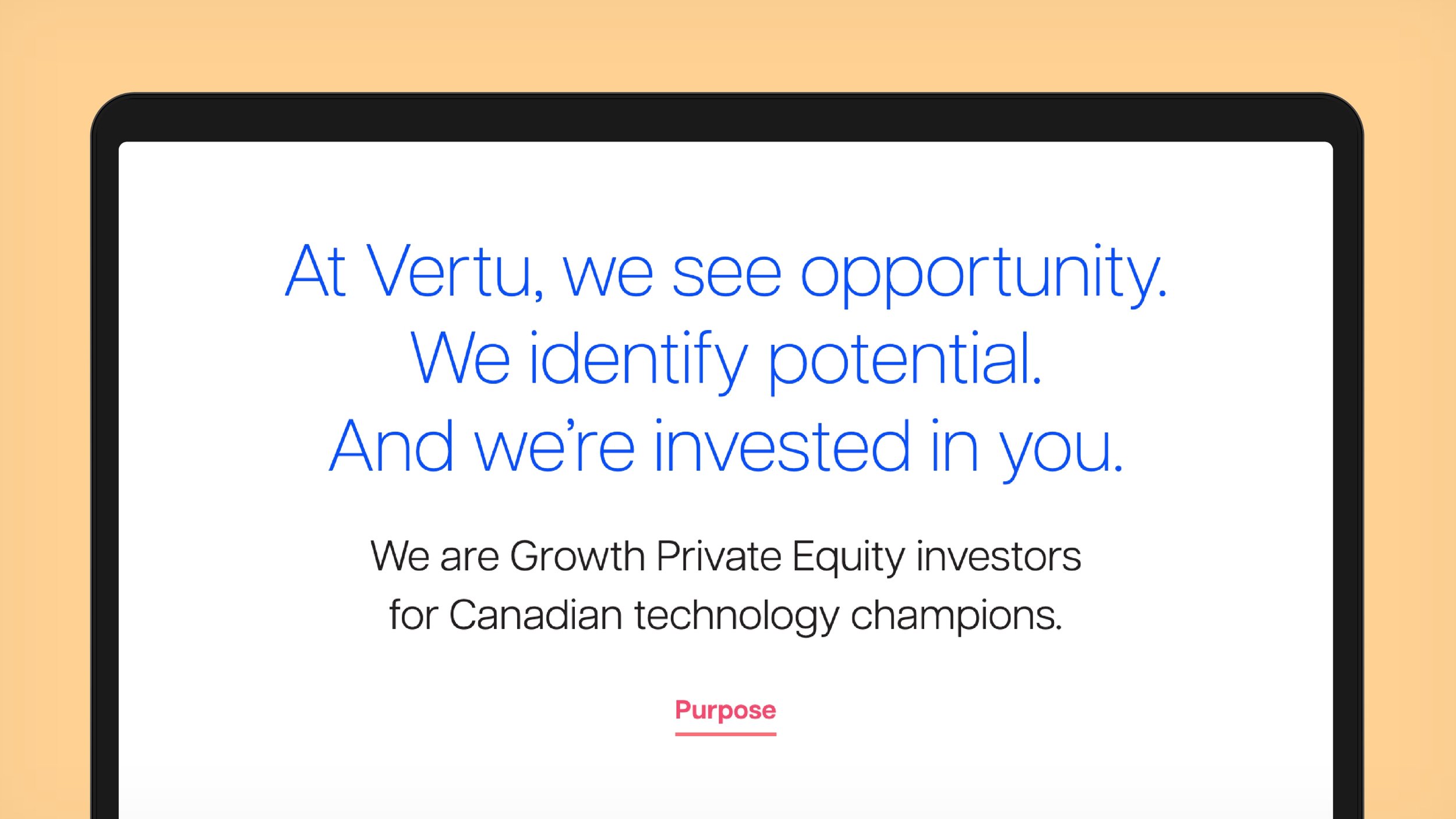
We’re invested in you.
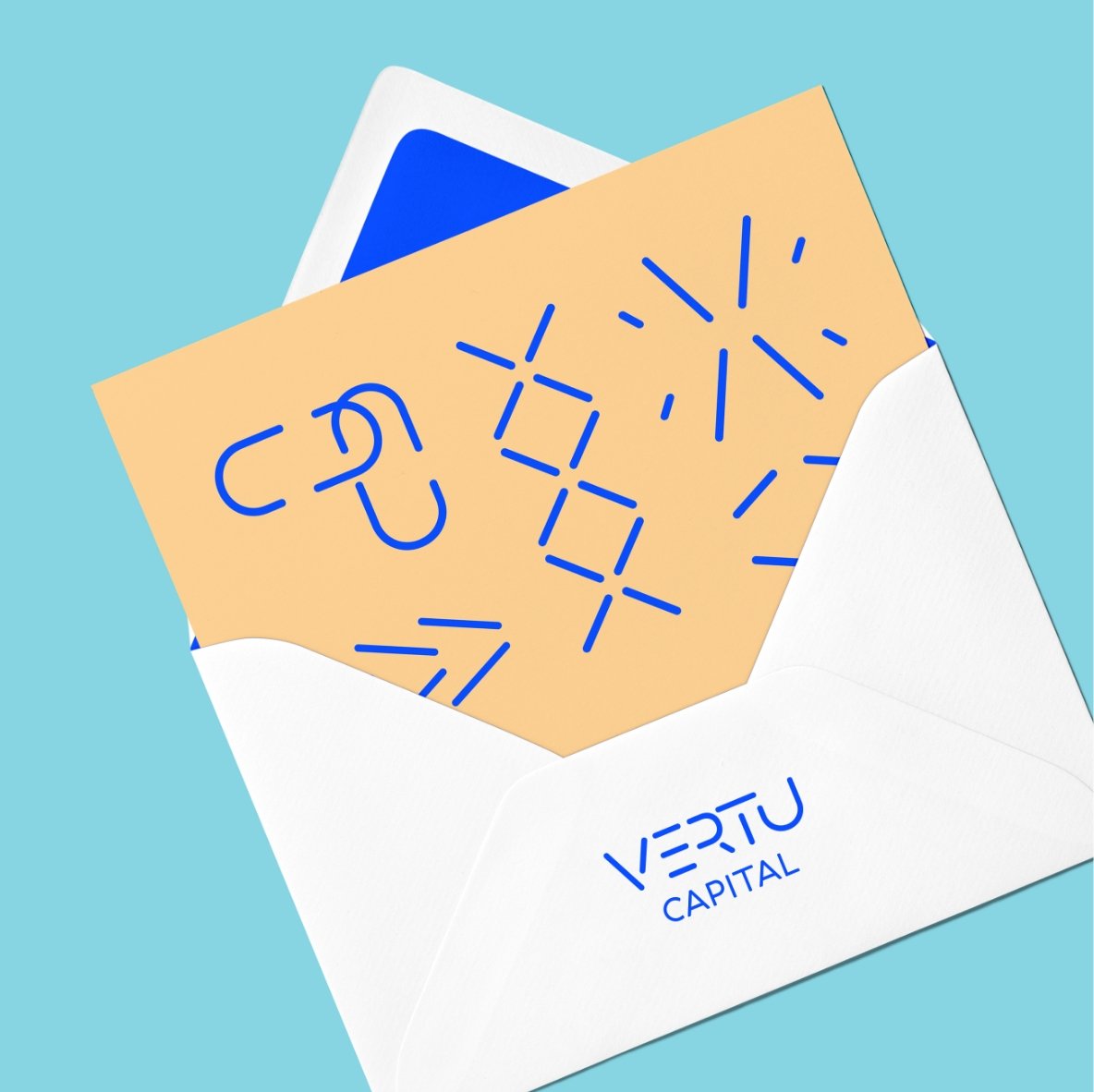
Vertu Capital
Brand Wellbeing Workshop, Visual Brand Identity, Typography, Illustration, Motion Design, Visual Brand Guidelines, Verbal Brand Guidelines, Website Design, Marketing Materials
Vertu Capital is Canada’s first, and one of North America’s only female founded private equity firms. Since their launch in 2018, they were quick to grow their seed funding and make several successful investments in the technology sector. Their unique relationship-focused approach has led to great success and a remarkable reputation. However, their unique approach also presented a challenge – how to showcase their different way of doing business, while also demonstrating their expertise and knowledge in an industry historically rigid and cut-throat.
Challenge
We embarked on extensive brand research and development phases that included interviewing stakeholder groups including employees and investors. Our efforts focused on understanding what it was about the Vertu approach that worked so well, and to tie the internal and external brand together, to reposition the organization for continuous growth and an amplified presence in their industry. The underlying core truth to Vertu’s success – a relationship-first approach, built on trust. Words often promised by competitors, but rarely lived.
Strategy


With our stategic foundation complete, the new verbal and visual identity work was guided by the right balance of the Vertu relationship-first approach with the hard skills and strengths of a successsful PE fund.
We focused in on the concept of ‘synchroncity’. Synchronicity occurs at the intersection of awareness, response, perspective, and action. It’s also about coming together – an assembly that makes a partnership strong and requires mutual respect and confidence.
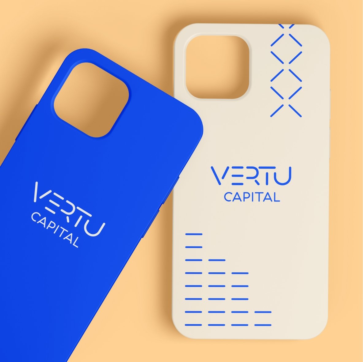
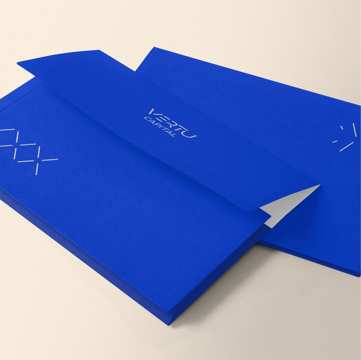
The new logo is pared down to the essentials. By removing parts of the letters, we get a nice balanced flow of the lines working in synchroncity together. Each line in the logo plays an important role, much like each member of the Vertu team, each bringing their essential and diverse expertise.
Where the norm of the industry is to use traditional dark and heavy colours, the new Vertu colour palette is a balance of warm and friendly hues, with a rich, vibrant blue to connotate their experience in the technology sector.
An animated icon library was created to visually tell the Vertu difference, while still maintaining the technology sector expertise.
From focus, to partnership, to leading, the new brand identity can show, not just tell, a differentiated approach to private equity.
Creative


-
![]()
Focused on you.
-
![]()
The Inspector.
-
![]()
fairlife® for your life
-
![]()
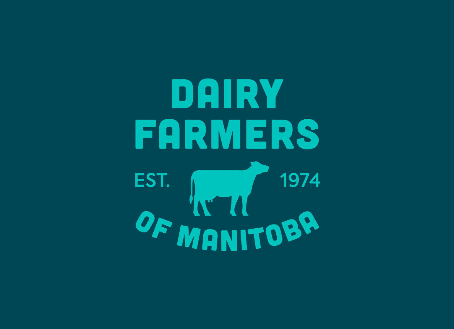
Family is the heart of dairy farming.
-
![]()
All from a good place.
-
![]()
Free to be me.
-
![]()
Transforming Frozen Food into Fine Dining.
-
![]()
Where there’s help, there’s hope.
-
![]()
Discover your roots.
-
![]()
Bigger Together.
-
![]()
A career in tech will take you there.
-
![]()
Love local. Eat local.
-
![]()
Here for Tomorrow.
-
![]()
Before it’s too late.
-
![]()
Informed Choices, Smarter Gambling.
-
![]()
Learning the Past, Changing the Future.
-
![]()
Accelerating Success in Ontario’s Electrical Industry.
-
![]()
Transforming Housing and Community in Calgary.
-
![]()
Quality and Tradition You Can Trust.
-
![]()
Empowering Youth to Take CTRL of Their Future.
-
![]()
Beyond the Beat.