Focused on you.
Lerners LLP
Brand Transformation, Brand Strategy, Brand Purpose, Brand Positioning, Brand Identity, Brand Rollout
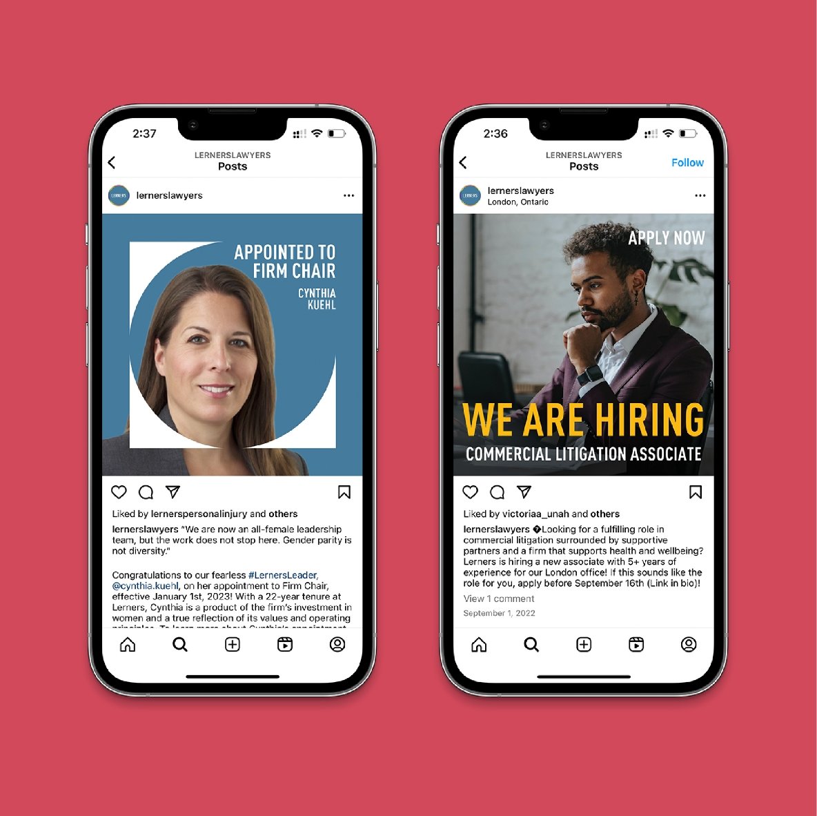
Lerners LLP is one of Ontario’s largest full-service law firms with five offices and more than 500 employees. Like most industries, the pandemic hit the legal sector hard with stagnated legal operations, backlogged cases, and staff burnout. Lerners also found itself facing heightened competition for new lawyer talent. So, to retain and attract top legal minds, and establish a united organization, Lerners needed to transform themselves to become a firm that resonated with clients and the needs of their current, and potential employees. The Lerners brand needed to become more human.
Challenge


Developing a brand identity with the ability to represent an organization as stakeholdered and diverse as Lerners was a very nuanced challenge. But by adopting a highly consultative process from the start, we were able to align on a strong new value proposition for the brand: We’re not just practicing law, we’re standing up for you.
Another key success factor was that we needed to make sure that all the lawyers felt represented in the rebrand, so the new brand identity needed to span diverse areas of legal practice – from criminal defence lawyers to personal injury lawyers, each line of business needed to have the tools to represent what they do. We conducted a customized Employee Wellbeing Survey across the entire firm and held 1:1 stakeholder interviews to help us better understand the current state of the brand, their employee wellbeing, and where the legal profession was headed as a whole.
Strategy

With the data and research insights, we could start crafting the brand’s new visual identity and tone of voice, bringing a tangible human aspect to the brand. We explored several ways to visually show the Lerners difference and the passion and talent their lawyers embody.
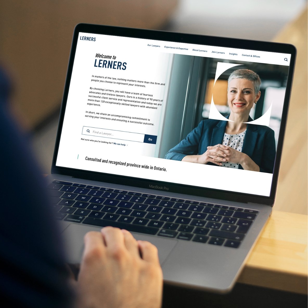
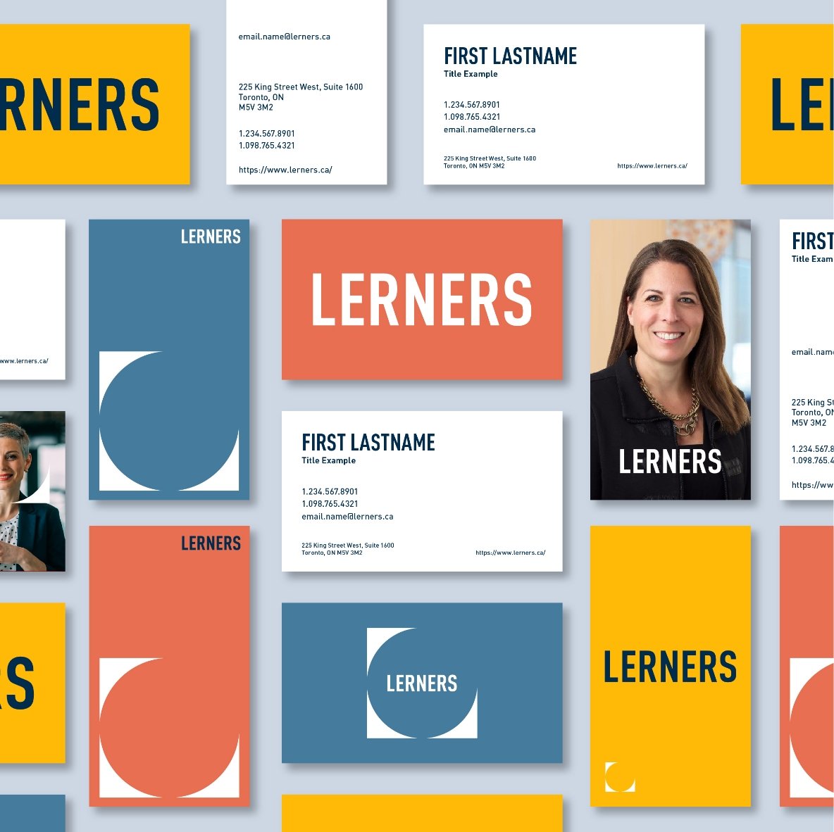
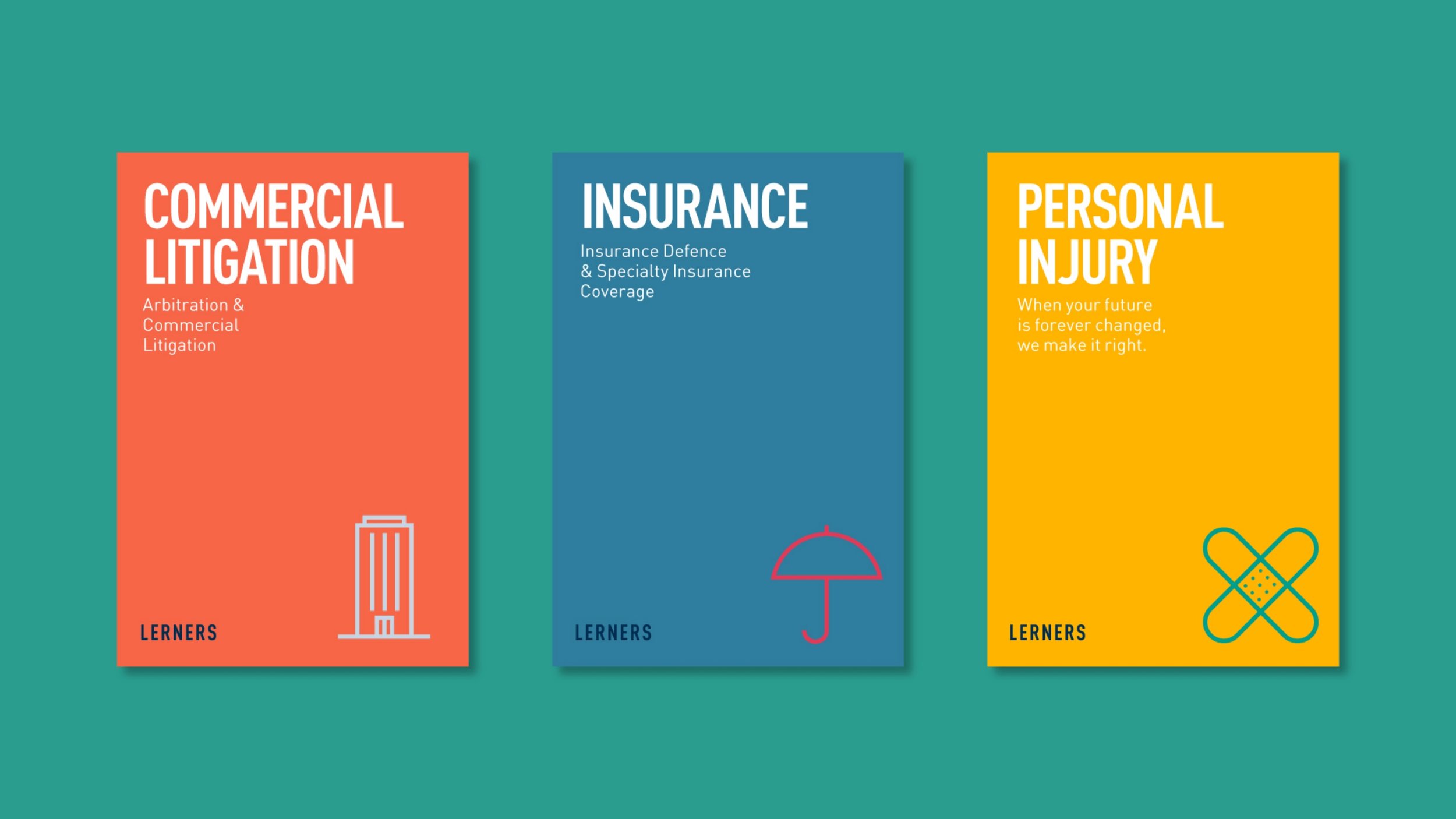
We started with creating the platform – ‘Our focus is you.’ This platform represents both the focus the firm has on their lawyers to support them and to help them excel in their careers, as well as their clients. Lerners lawyers are smart, driven, dedicated and focused on their clients. This platform translated well to a graphic device that owns focus. A blend of the focus icon in a camera and the L from Lerners, the design expression was that their focus is You. We then created a robust colour palette that was warm and friendly yet professional, breaking the industry norm for using colours that are dark and heavy. The focus theme also comes through in the photography style where depth of field is used to highlight the subject. Additional design and production deliverables for the rebrand, included: new logo, typeface, graphic symbol, colour palette, brand toolkit and photography guidelines. We also created an internal employee video to inform, educate and engage Lerners employees and create enthusiasm for the new brand.
Creative

-
![]()
The Inspector.
-
![]()
fairlife® for your life
-
![]()
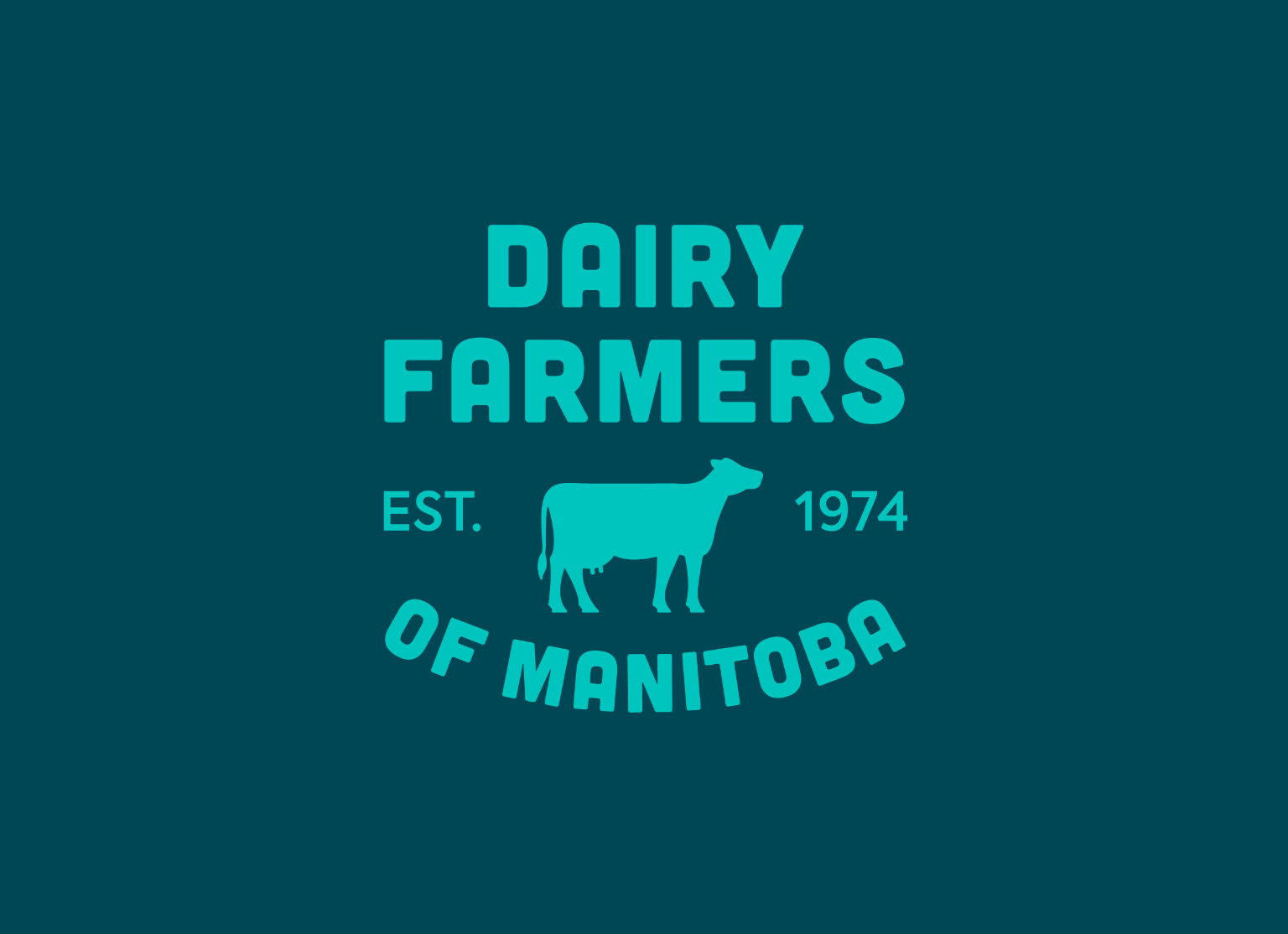
Family is the heart of dairy farming.
-
![]()
All from a good place.
-
![]()
Free to be me.
-
![]()
Transforming Frozen Food into Fine Dining.
-
![]()
Where there’s help, there’s hope.
-
![]()
Discover your roots.
-
![]()
Bigger Together.
-
![]()
A career in tech will take you there.
-
![]()
Love local. Eat local.
-
![]()
Here for Tomorrow.
-
![]()
Before it’s too late.
-
![]()
Informed Choices, Smarter Gambling.
-
![]()
Learning the Past, Changing the Future.
-
![]()
Accelerating Success in Ontario’s Electrical Industry.
-
![]()
Transforming Housing and Community in Calgary.
-
![]()
Quality and Tradition You Can Trust.
-
![]()
Empowering Youth to Take CTRL of Their Future.
-
![]()
Beyond the Beat.
-
![]()
We're invested in you.