Accelerating Success in Ontario’s Electrical Industry.
Ontario Electrical League
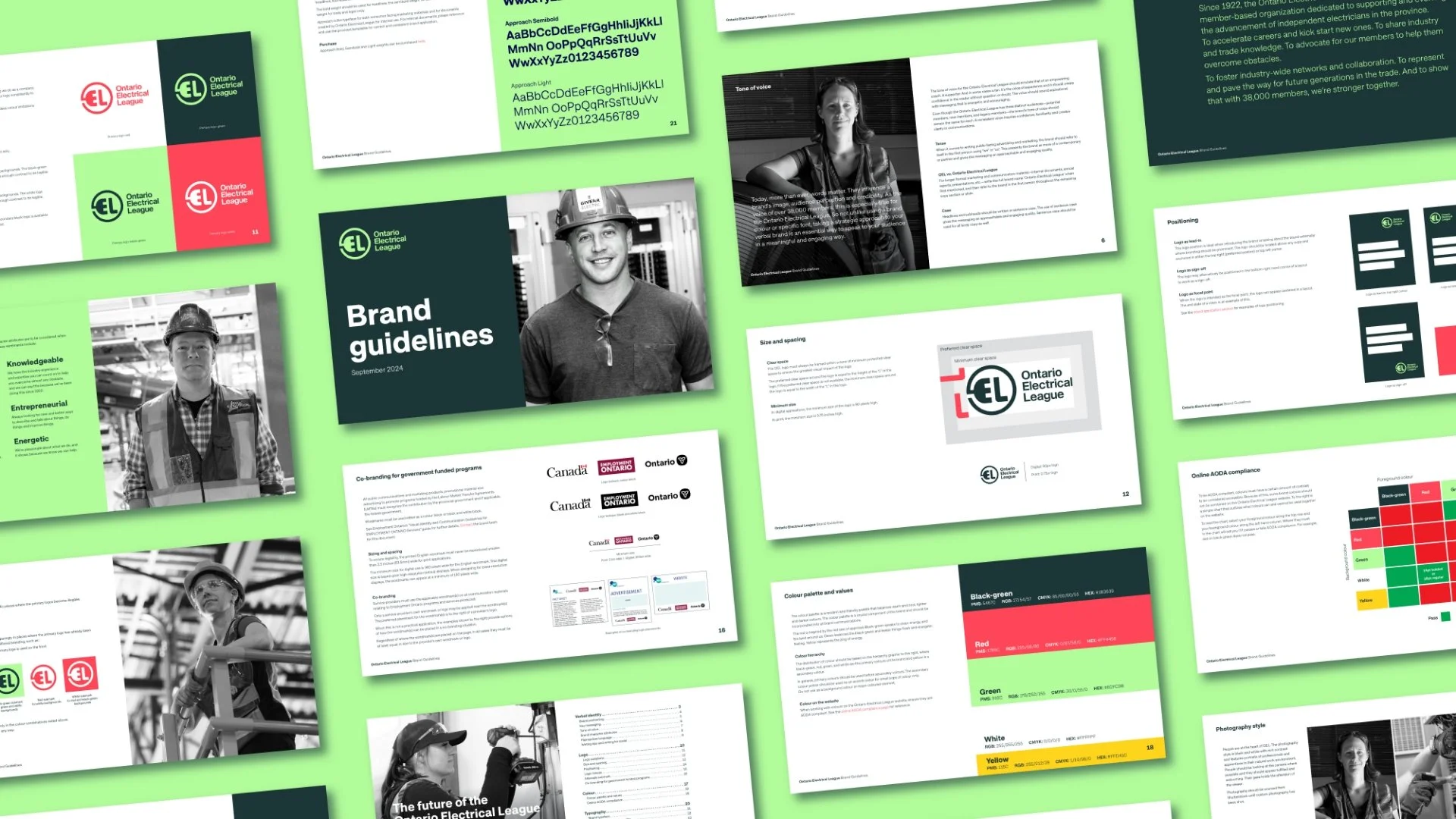
Brand Purpose, Brand Strategy, Verbal Identity, Visual Identity, Brand Guidelines, Marketing Materials
With over a century of history, OEL faced the challenge of staying relevant to a new generation while maintaining its connection to long-time members and reaffirming its role as a forward-thinking leader.
Challenge

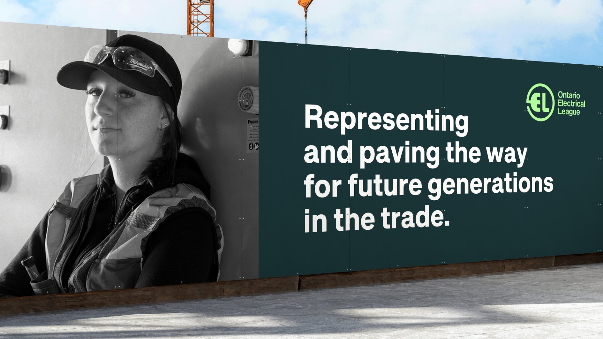
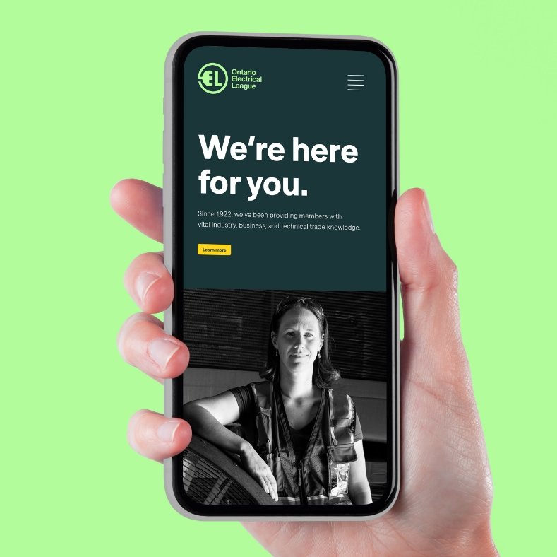
The Ontario Electrical League (OEL), a non-profit representing over 38,000 members across Ontario’s electrical industry, sought to strengthen its position as a forward-thinking leader while engaging the next generation of talent. Our mission was to evolve OEL’s brand identity and positioning to resonate across the industry.
We started with in-depth interviews and surveys to capture insights from employees, current members, and prospects, ensuring all sectors were represented. A competitive analysis highlighted OEL’s unique strengths, while an audit of their communications uncovered key gaps.
Using our Wellbeing Framework™, we redefined OEL’s role as a catalyst for its members’ success—empowering their careers, businesses, and the industry. This inspired a new brand positioning: “While members work hard to power our communities, OEL works hard to empower them.” The positioning reflects OEL’s commitment to enhancing members’ Functional, Esteem, and Social Wellbeing, supporting their growth and the industry’s future.
Collaborating closely with stakeholders, including the board of directors, we aligned on this transformative vision, ensuring it resonated throughout the organization.
Strategy


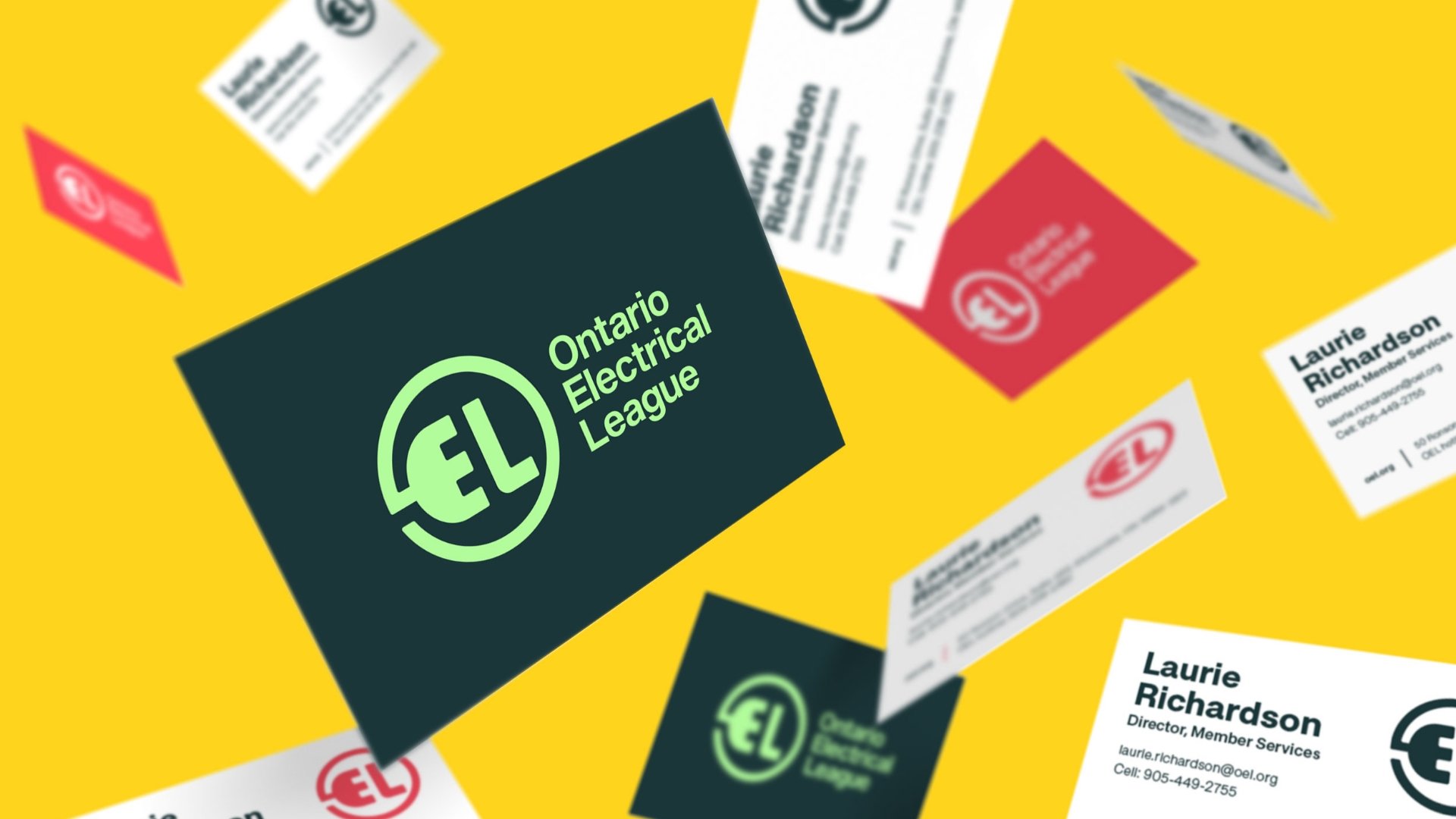
The rebrand for the Ontario Electrical League (OEL) balanced its rich history of over a century with a forward-looking vision. Honouring OEL’s legacy, we saw potential in the existing logo’s integration of an “E” and “L” with an outlet icon. To modernize it, we refined the line weights and introduced softer, friendlier curves, creating a more cohesive and contemporary design.
The typography was also updated to enhance readability and accessibility. We chose a modern, approachable font and set the wordmark in title case with increased size for improved legibility. This gave OEL a fresh, inclusive identity aligned with its commitment to supporting a diverse industry.
For a progressive and environmentally aware aesthetic, we replaced black with a palette centred around green—representing both sustainable energy and Ontario’s vibrant forest landscape. The new photography style focuses on authentic, diverse portraits of members, reinforcing that OEL’s strength lies in its people.
Beyond the visual elements, we crafted a refreshed verbal identity with brand positioning, key messages, and a collaborative tone of voice. This storytelling framework highlights unity and progress, paying homage to OEL’s historic role in advancing independent electricians across Ontario.
Creative


-
![]()
Transforming Housing and Community in Calgary.
-
![]()
Quality and Tradition You Can Trust.
-
![]()
Empowering Youth to Take CTRL of Their Future.
-
![]()
Beyond the Beat.
-
![]()
We're invested in you.
-
![]()
Focused on you.
-
![]()
The Inspector.
-
![]()
fairlife® for your life
-
![]()
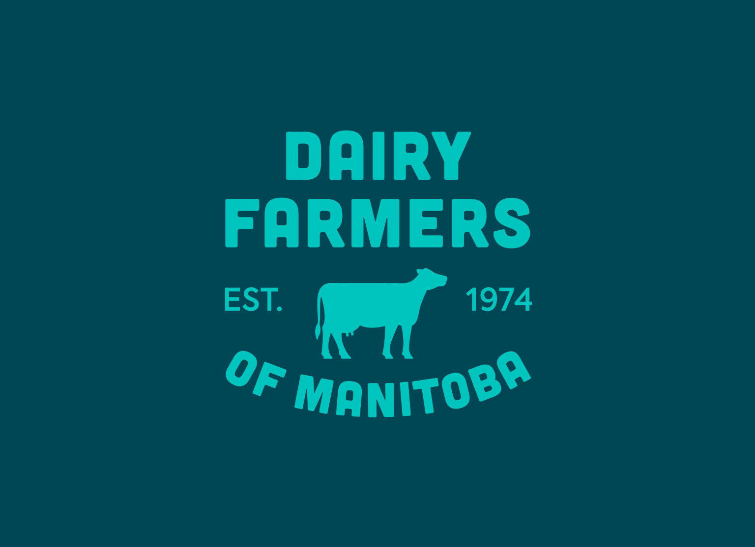
Family is the heart of dairy farming.
-
![]()
All from a good place.
-
![]()
Free to be me.
-
![]()
Transforming Frozen Food into Fine Dining.
-
![]()
Where there’s help, there’s hope.
-
![]()
Discover your roots.
-
![]()
Bigger Together.
-
![]()
A career in tech will take you there.
-
![]()
Love local. Eat local.
-
![]()
Here for Tomorrow.
-
![]()
Before it’s too late.
-
![]()
Informed Choices, Smarter Gambling.
-
![]()
Learning the Past, Changing the Future.