Family is the heart
of dairy farming.
Dairy Farmers of Manitoba
Brand Transformation, Brand Purpose, Brand Strategy, Brand Identity, Brand Positioning, Brand Rollout
The brand was suffering from low awareness in the province and needed to build brand affinity and attribution.
Challenge
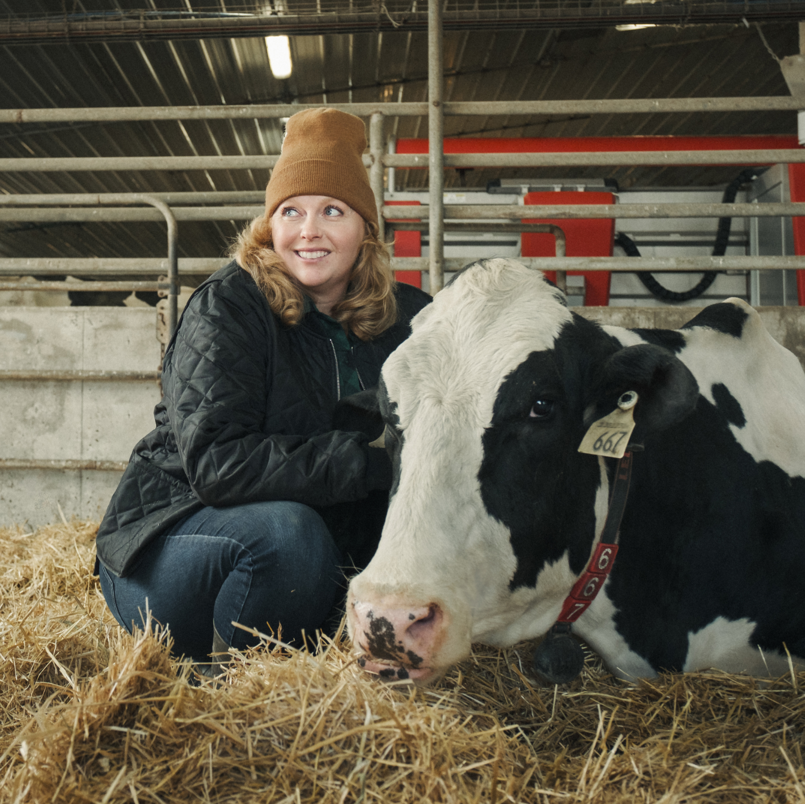
To increase awareness and bridge the gap between Manitoba’s dairy farmers and young Manitoba families, we needed to tell people that family and tradition are at the heart of dairy farming.
The scope of the strategic development of the rebrand was extensive and included: brand strategy and purpose modelling; stakeholder and board alignment; semiotic and focus group testing; and a new brand positioning statement: Family is at the heart of Manitoba dairy farms.
Strategy

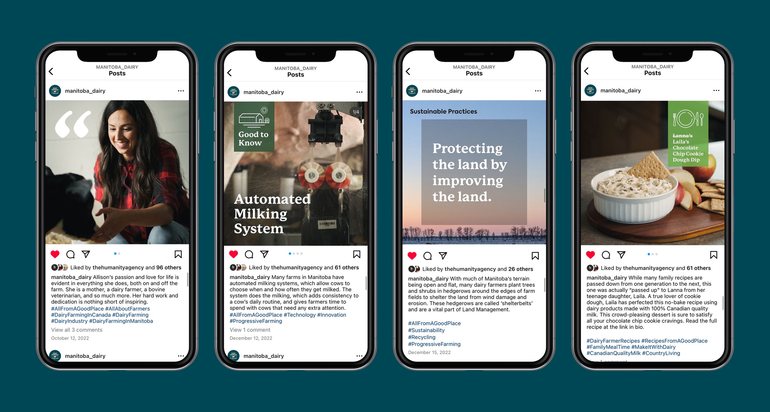
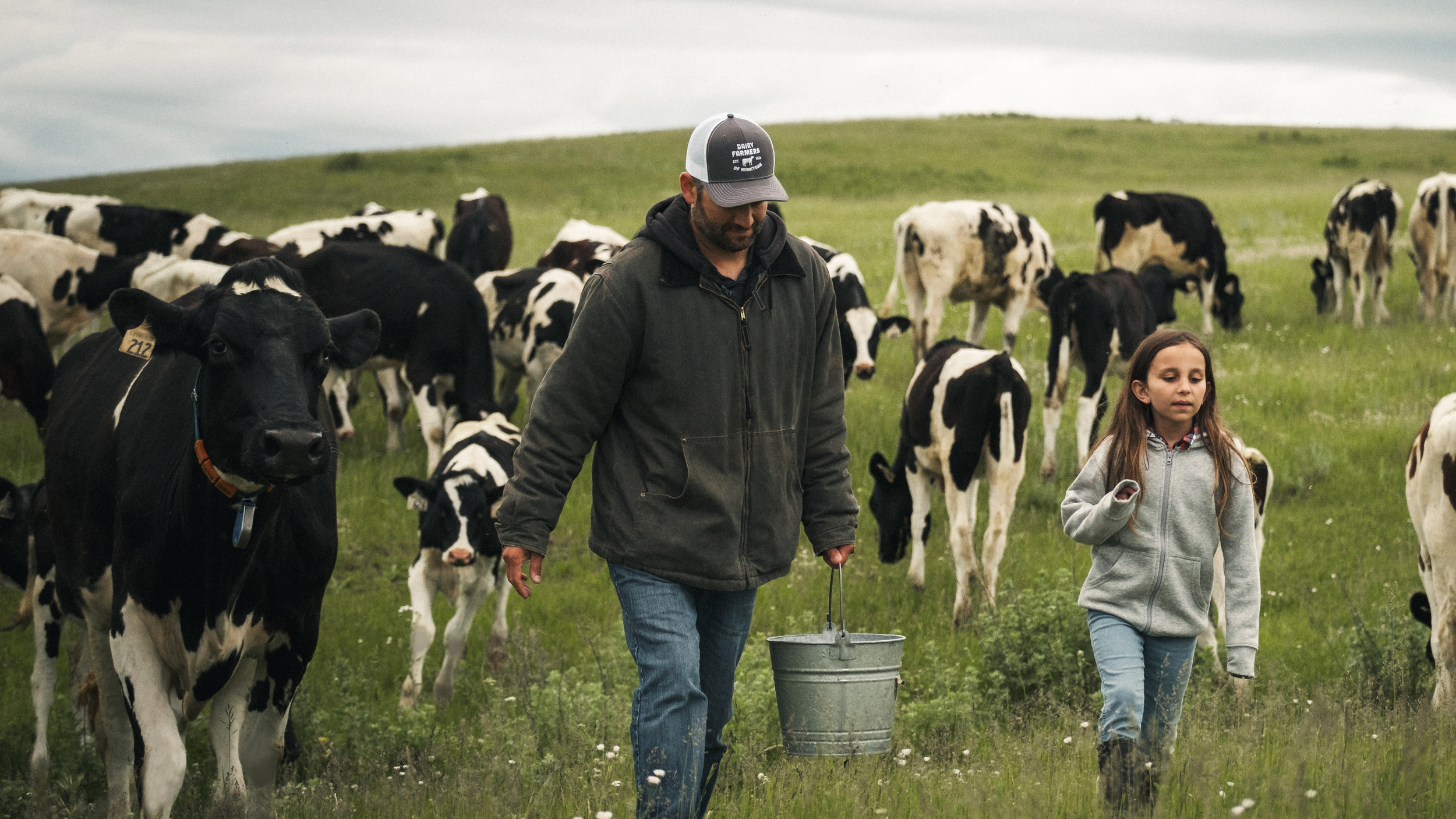
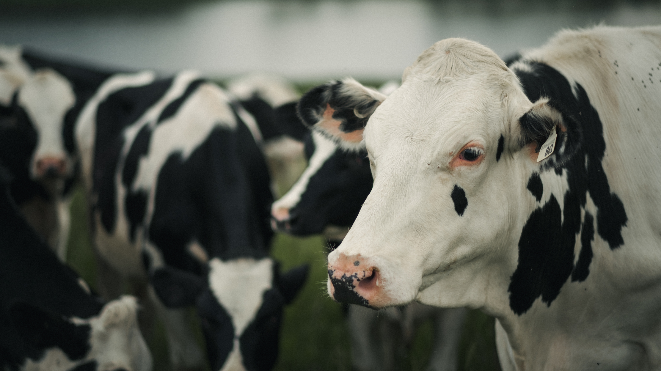
Working with the insight from the strategic phases helped inform and guide the brand’s transformation. This included: the design of a new logo, new design system, new brand guidelines, and a new website with refreshed brand content, all of which was created to represent the farmers, but also resonate with Manitobans. For example, the logo is bold and honest, and amongst the vast prairie landscape, easily legible. The design speaks to the heritage of the brand through the font choice and the edition of EST. 1974. The forward-facing cow represents commitment to animal care, the dairy industry, and the future. The curved ‘smile’ at the bottom of logo, taps into the notion of ‘friendly Manitoba’ and the pride people living there feel. And supporting design elements, such as the brand’s colour palette, was inspired by natural ‘on the farm’ tones, photography that features actual Manitoba dairy farmers and TV and video content that shares true, authentic stories about Manitoba’s dairy farmers and their families.
Creative


-
![]()
All from a good place.
-
![]()
Free to be me.
-
![]()
Transforming Frozen Food into Fine Dining.
-
![]()
Where there’s help, there’s hope.
-
![]()
Discover your roots.
-
![]()
Bigger Together.
-
![]()
A career in tech will take you there.
-
![]()
Love local. Eat local.
-
![]()
Here for Tomorrow.
-
![]()
Before it’s too late.
-
![]()
Informed Choices, Smarter Gambling.
-
![]()
Learning the Past, Changing the Future.
-
![]()
Accelerating Success in Ontario’s Electrical Industry.
-
![]()
Transforming Housing and Community in Calgary.
-
![]()
Quality and Tradition You Can Trust.
-
![]()
Empowering Youth to Take CTRL of Their Future.
-
![]()
Beyond the Beat.
-
![]()
We're invested in you.
-
![]()
Focused on you.
-
![]()
The Inspector.
-
![]()
fairlife® for your life.