-

Changing how players make smarter,
more informed choices. -

Stories of Changemakers who fought
for human rights. -
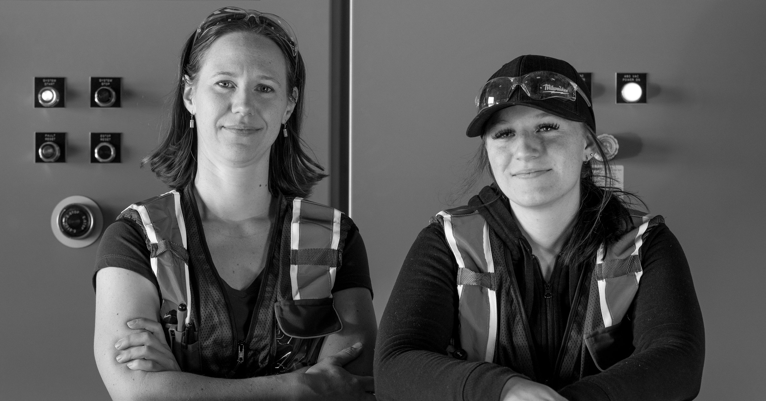
Championing change in
Ontario’s Electrical Industry.
Built for Changemakers.
Powered by Purpose.
We’re a full-service marketing agency
turning bold ideas into lasting impact.
For purpose-led founders, progressive
thinkers, and those building what’s next.
Work —
Informed Choices,
Smarter Gambling.
Learning the Past,
Changing the Future.
Transforming Housing and
Community in Calgary.
Accelerating Success in
Ontario’s Electrical Industry.
Quality and Tradition
You Can Trust.
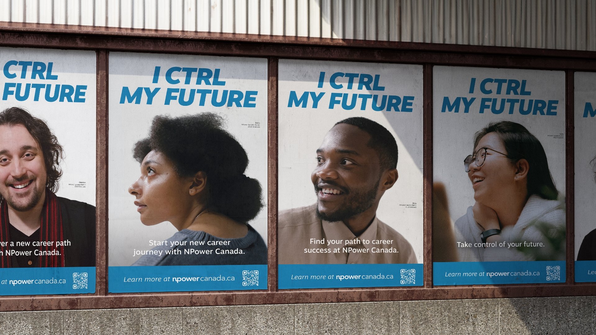
Empowering Youth to Take
CTRL of Their Future.
In the Works —
What we’re building, launching, and learning
Changemakers —
A few we’ve partnered with
Building
With Us —
-
Sarah Woodgate
“Thank-you to the Humanity team for being such insightful and expert partners in Calgary Housing's Brand Transformation! Your ability to guide us through the process—facilitating meaningful conversations, asking the right questions, and creatively translating our business model transformation into a cohesive brand—it has been invaluable. Our rebranding journey was about far more than a new logo; it was about capturing the heart of who we are as a purposed-driven social enterprise. Together, we crafted a brand that reflects our commitment to creating homes and building communities where individuals and families can flourish.”
-
Tony Aziz
“Thank you to Humanity for being an amazing partner in our journey, helping us launch our corporate Brand Transformation and our new line of Specialty Breed Poultry. Your support and expertise have been invaluable.”
-
Louise Waldman
“Working with Humanity has been an incredible experience, unlike any agency I have ever worked with before. The focus on collaboration and co-creation results in work that is really transformative.”
-
Teresa Ciccarelli
“Over our long partnership, Humanity’s dedication to our brand transformation has delivered outstanding results. Our strong working relationship and their collaborative approach have been invaluable to Dairy Farmers of Manitoba.”
-
Marina Joseph
“Humanity has helped evolve our strategy at Big Brothers Big Sisters as we prepare to champion the wellbeing of youth for the next century. Together, we accomplished key milestones and created a roadmap forward to evolving the brand identity to be a more inclusive one. Their sweet spot is specializing in behavioural science-based strategy and creative execution that is relatable, aspirational and inspirational.”
-
Darren Nimegeers
“The rebranding journey Calgary Housing embarked upon with Humanity was more than just a visual update—it was about capturing the heart of who we are and how we serve. Humanity’s deep understanding of our recent transformation allowed us to express our role as a social enterprise that not only provides affordable housing but fosters strong, vibrant communities. Central to this new identity is our logo, featuring the Black-capped Chickadee, a symbol of home and community, which beautifully ties together our story of empowerment and service. Humanity’s approach helped us create a brand that reflects the warmth, trust, and long-term vision we strive to bring to our residents and the sector.”
-
Paulette Minard
“We had a great experience working with the team at Humanity. Really pleased with how they helped us bring our Shoppers Foundation Impact Report to life.”
-
Natalee Davis
“Collaborating with the Humanity team on this project was an incredible journey. Their focus on the human element was instrumental in ensuring our brand consistently reflects our values. Engaging with our lawyers, staff, and clients throughout this process was a rewarding experience, and we are proud of the outcome.”
-
Mackenzy Bodden
“AMAZING!! We are so excited to publish our new report and it’s all thanks to the wonderful work your team did to bring it all to life this year! Excited to continue working with Humanity in the future.”
-
Leah Wells
“As an established non-profit we have a clear mission and vision, but were looking for strategic support to articulate our unique selling proposition: why Credit Canada is the best first call for people facing unmanageable debt. We opted to work with Humanity because of the strong alignment in values and approach. Their team took the time to understand not just our work, but the people behind it, including our clients, counsellors, educators, and staff.
Using their Wellbeing Framework, we collaborated to define the role Credit Canada plays in people’s wellbeing in a way that’s both strategic and authentic. The result was a clear, actionable USP that now anchors our marketing. Their talented creative team brought that positioning to life through a campaign with striking visuals and messaging that resonates with the people we serve.”
-
Matthew Cutler
“There is so much research, thought, and intention behind this new brand. What's most remarkable however, is that the research and thinking has roots into our exhibition, education, and other museum practices. You and the team have demonstrated best practices in brand evolution—ensuring the work goes deeper, engaging more than just communications and ensuring the process reflects and informs culture, identity, and services.”


